Self Evaluation (ECP&E)
Abstract
This EMP investigates the ability of design to embody identity and culture, of Czech national identity and graphic style in particular. The vehicle for this brief is the Prague 2020 Olympics. The aim is to show how identity design can retain the soul of the place it represents (Prague in this case) while being able to translate to an international audience, without falling prey to monoculture. The intended audience is therefore two-fold – the national audience of Prague and the Czech Republic where the Games would take place, and the international audience which inevitably comes with an event like the Olympics. The Prague 2020 Olympics is approached as a real event, to simulate a live brief atmosphere. The final outcomes of this brief is a body of work appropriate to the subject: an identity design accompanied by pictograms, torch designs and medal designs.
Self Reflection
With every brief there are successes and pitfalls, and no matter how good a project is there is always more that could be done or changed. I realize that a few bumps and scrapes along the way are no exception, but it does seem that this project was limping on one leg from the start upon reflecting on my time planning calendar (from the events in January for example). It is completely normal to work on multiple projects at once, at BA, MA and industry level, but there are certain events that are beyond control. Despite January complications, I think I managed to stay on track in the early stages of the unit. During the learning agreement phase I believe I was even slightly ahead of others in my tutorial group with minimal changes required to my learning agreement. My subject and focus were fleshed out clearly and concisely. I think this is thanks to the early idea generation over Christmas break. I had already brainstormed various subjects for my EMP, and pinned down the one which ticked all the boxes.
The ominous phrases ‘sustained focus’ and ‘significant body of work’ from the unit brief loomed over my head. I had discarded all other ideas because I needed to find something I was passionate about. Something that would stir enough enthusiasm and motivation to sustain me (sustain referring to the breadth of subject appropriate to an EMP) and keep me focused (focus providing depth and direction) over the long weeks of the project. The Prague 2020 Olympics brief could most definitely lead to a ‘significant body of work’ because design for the Olympics is an immense undertaking which is usually tackled in teams over many months. In terms of final pieces I wanted to prioritize on creating the identity and matching pictograms first, and then pick a few of the possible supporting design options (such as mascot design, stadium concept, torch design, medal design, promotional materials, advertising and so on).
The project also fulfils my own personal aims and objectives and is designed with my ‘career planning’ in mind. At the beginning of the year I set out the aims of improving my software skills in Illustrator and my overall typography skills. The over arching aim for this year was to choose projects which would be portfolio-appropriate (esp. for MA study); projects I had never done before and which pushed me out of my comfort zone. My EMP fulfils all these requirements and now sits as the highlight of my portfolio, the pinnacle of my accomplishments at university; which is what an EMP should be. I also wanted my EMP to support my pursuit of MA study (which is reinforced by the nice link forged between my dissertation and the EMP and the transition it provides; my dissertation was ending as the EMP was beginning). The Czech orientation could potentially open doors in the future of perhaps working in the Czech design industry. Lastly, the EMP subject and focus is a particularly successful choice because it resonates with me on a personal level. I am a Czech who has lived abroad all her life, so in theory I could actually be the best person for the job because I have a foot in each camp – international and national (which is the intended audience).
The research methodologies for this project consist of a mix of primary and secondary research. The ‘type’ of project my EMP is can be defined as: critiquing existing designs and producing alternatives. The most important existing design I looked at, was the main case study of the Prague 2016 Olympics Applicant City identity. This is the case study that started it all because the problem I identified was the general lack of success of the logo (this view is reinforced by a TYPO magazine article I analyze in my EMP publication). The case study came across as flat, generic, uncreative and failed to capture the spirit of Prague or even a sense of place. This became even more evident when the identity was viewed amongst the supporting case studies, all the other 2016 Olympic Candidate and Applicant City logos. Already a pattern is emerging in methodology; picture the process in concentric circles, with the EMP Prague 2020 identity as the centremost circle. Gradually you travel outwards following the natural transition from the focal point (which gives it depth) to the broader subjects the EMP deals with (which give it breadth). The next concentric movement outwards leads to investigating the Olympic Games in general (their history, the modern games, the Olympic Rings Logo, Olympic symbols, and Olympic Logos of various cities through the years). This stage was important not only as background information for the project, but it was directly relevant to the final designs. I intentionally wanted to keep everything as politically correct as possible and work to the set constraints of the Olympic design rules to simulate the nature of a live brief. The Olympics in and of themselves raised social, cultural and political issues. As exemplified by the Olympic Rings logo case study, any bias, prejudice or favouritism between countries had to be avoided at all costs because it is such an international event with altruistic aims of peace, and bringing out the best in man, at its heart. Historically the Olympics are renowned for their white flag policy of neutrality even during wartime. The Olympics as an event set up one half of the intended audience my final designs had to be aimed towards: the international community. This brings me to the second half of the intended audience: which is Prague and the Czech nation. The designs need to communicate clearly to both audiences, not lost in translation, in order to be considered successful. The Czech element brings the EMP back to its overarching theme – exploring Czech national identity as depicted through art, history, design, culture etc. The concept of identity and the importance of culture triggered yet another concentric movement outward to the theoretical framework which the entire project sits inside of – semiotics (esp. symbols), identity design, and design vs. monoculture.
I think that though I created a solid base of research methodologies, as outlined above, to build the EMP upon, all the ‘concentric circle’ areas could have been explored a lot further. I’d say the most thorough research section is on the Olympics (because it was supported to an extent by the background research I had done for my dissertation). This is where the brunt of the various pitfalls begins to show due to the complications in January (which I already mentioned and which are visualized on my time plan). A lot of time was either lost (travel issues/illness) or simply had to be directed to my more immediate priorities (RCA application closely followed by the dissertation). To be quite critical of myself, I would say the experiment generation phase is probably the Achilles heel of the entire project. I think there were quite a few ‘loose ends’ (which I discuss later) which could have been pushed a lot further and would have boosted the overall quality of the EMP. Otherwise the visualization, development, synthesis and finalization came off better than I expected (due to the complications I was working with; explained later). I think I quite thoroughly evidence the changes and progress of all the designs.
I had some primary research from photos I had taken on recent trips to Prague. What would have been ideal given more time, is if I could have gone for a week to Prague to solely focus on research for this project. I could make a plan in advance of places to go and people to meet (such as individuals on the Prague Olympic Committee and designers/agencies behind famous main Czech identity designs). First hand research could be applied towards the end of the project as well, if I created a reliable survey to judge the effectiveness of the identity on a national (Czech) and international level. I did manage get outside feedback throughout the project which could be considered national and international, but on a very small scale. This feedback had an inherent bias because it was mostly from tutors, friends, acquaintances and family members; just a handful of people, which meant it was a tiny sample group in statistical terms. Speaking of statistics, surveys and primary research, I chose Jenny South’s FMP on the North-South Divide in the UK for ‘peer evaluation’. Her project was the only one with significant relevance to my EMP (I even consulted the tutors to see if perhaps they knew of a second person I could peer evaluate and no one else came to mind). She posted online surveys and even travelled to various cities in the North and South to determine the basis for the current North-South Divide. She got people to draw a line on a map of the UK where they thought the divide was. She took down other details such as where they were from and where their parents were from to see if there was any correlation between the data. This part of her presentation really made an impression on me and I thought it added a lot to her project. Unfortunately for my project, trying to do something similar would be rather difficult due to the sheer scale involved for trying to survey an entire country (the Czech Republic) as well as the world (since the Olympics are international). I could try it on a smaller scale, along the lines of Jenny’s 100-200 sample size to see if the results bear any fruit.
There was a clear contrast between her methodologies and mine, though I don’t think there is an exact science to doing these things. Her project started very broad (with fabric, which lead to the metaphor of social fabric) and gradually narrowed down through experimentation. I started with both a clear focus as well as a broad subject; initially I concentrated on the focus Prague 2020 Olympics and slowly made my way outwards – refer to the concentric circles metaphor again for this. At one point I even considered dropping the Prague 2020 Olympics direction altogether but it unwaveringly remained the best vessel for my EMP.
Jenny also considered creating a typeface which would contrast the social fabric of the country, which is surprisingly similar to my initial ambition to create a ‘Prague typeface’; around the metaphor of ‘the face of Prague’ based on findings in my primary research. My typography idea was something which could have, once again, been taken much further given more time. I did create the type for the logo and now that the style and nuances are established, I think it could definitely be developed into a full typeface.
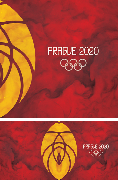
There were a few more loose ends. Primarily the mascot design and Olympic stadium design which were trumped by the medal and torch design and promotional materials on the priority list. The mascot went through three reincarnations and was still not working well with the visual style of the identity and pictograms. I think the concept design of the Olympic Stadium turned out well given the time I allotted for it. But to realize the design at a professional level I would need to collaborate with an architect because this reaches far outside my area of expertise. I also came across a few ideas of how I could branch the project out into other avenues in the future: designing Olympic team uniforms (could collaborate with a fashion/costume person on this) and making the Olympics more ‘green’ and eco friendly. The ultimate decisions regarding the fate of all of these points of potential came down to my priority list and time availability. Often I had to make hard decisions quite quickly to keep the project moving forward.
For my EMP I wanted to avoid the soulless design of the Prague 2016 Applicant City and really capture the essence of Prague. The logo should be a symbol devoid of text, which can stand on its own, and should have a story behind it which opens the book to the even bigger story of the city of Prague. The concept and theme behind my entire project came out on the other end of a long line of chain reactions based on research, sketches and experiments. This chain happened in this order: the Sokol/Falcon Movement, Libuse Legend, Stone Faces of Prague (primary research), the Astronomical Clock, The National Theatre, the Princess with the Golden Star, and Orion Chocolate Company. Please refer to the EMP publication for further details and thorough explanation. I chose the concept of ‘reaching for the stars’ based on all the cross references of the star as a symbol in the chain reaction.
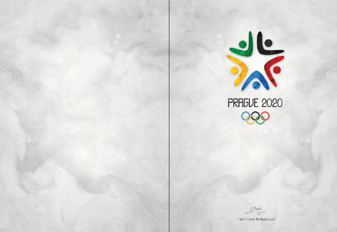
The final logo, I believe, is the concept in its purest form using the bare minimum of marks to communicate what it needs to. It is a ‘smart’ design like that which I admired in the Sochi case study because it can be read in different ways. On the most obvious level it is a star, the symbol I chose to carry the concept to the viewer. If you look closer you realize the star is made up of five figures (each depicted by raised arms and a head) who can be interpreted as ‘reaching up’ (for the stars of course), hugging together, or even raising their arms in victory as if they just finished a race. And lastly the shapes of the figures serve as visual arrows, directing the eye towards the centre of the star from whichever direction the viewer approaches the design; thereby communicating togetherness, coming together, oneness which are all big elements of the Olympics. Due to my dissertation I learned a great deal about the Olympic Rings logo and why it is the way it is. It was because of this that I made the informed decision to use the traditional Olympic colours (used on the Olympic Rings) in my logo. This would transfer the properties of those colours, as used in the Olympic Rings, to my logo (allowing all countries to associate with the logo based on the colours relevant to their flags). I felt that this was an important decision in catering for the international audience, rather than making the colours only relevant to Prague or the Czech Republic and thereby alienating the international community to an extent. All of these things positively reinforce the message I set out to communicate and add to the meaning of the logo rather than detract from it. That is why I believe my solution is a successful one, especially when seen within the context of all the other Olympic Logos as well Czech contemporaries (refer to EMP publication for more).
Throughout the project I took into consideration advice given to me during tutorials as well as by fellow designers. I felt that last year I was too unsure of myself and relied too heavily on the opinions of others because I felt too inexperienced. In hindsight I think that I have made vast improvements in this area throughout the final year though by no means have I forgotten the value in getting a second opinion, or of constructive criticism.
Time management has always been an issue for me. The second most problematic part of the project (besides the rough start in January) was created by the big gap of time I missed on the unit at the end of March (see time planner calendar and blog for more details). I was not happy with how things worked out at this rather important time in the unit but I believed I could make up a lot of ground over Easter. Once again I started with the best intentions but a snowball effect ensued. That is why during the second week of Easter I spoke to the course leader and was able to get a week extension, because I knew already at this point I was too behind to recover lost ground. Good intentions can only get you so far before reality sets in. Given the extra time and tutorials which I had lost, I could have gotten a lot more from the unit but I recovered as well as I could from all the setbacks, informed my tutors appropriately throughout, and even managed to surprise myself in the end with the amount and quality of work I was able to produce (esp. in the final designs and the publication).
